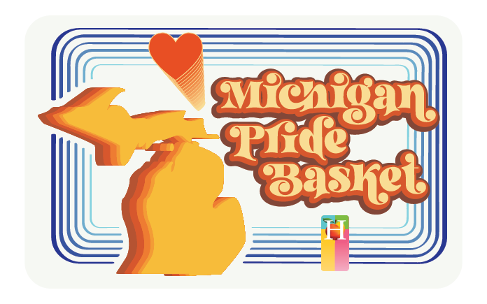
Horrocks Farm Market
an overview
Role:
Seth Nelson
Director of Art & Media
October 2020 – July 2022
A beloved Lansing Icon,
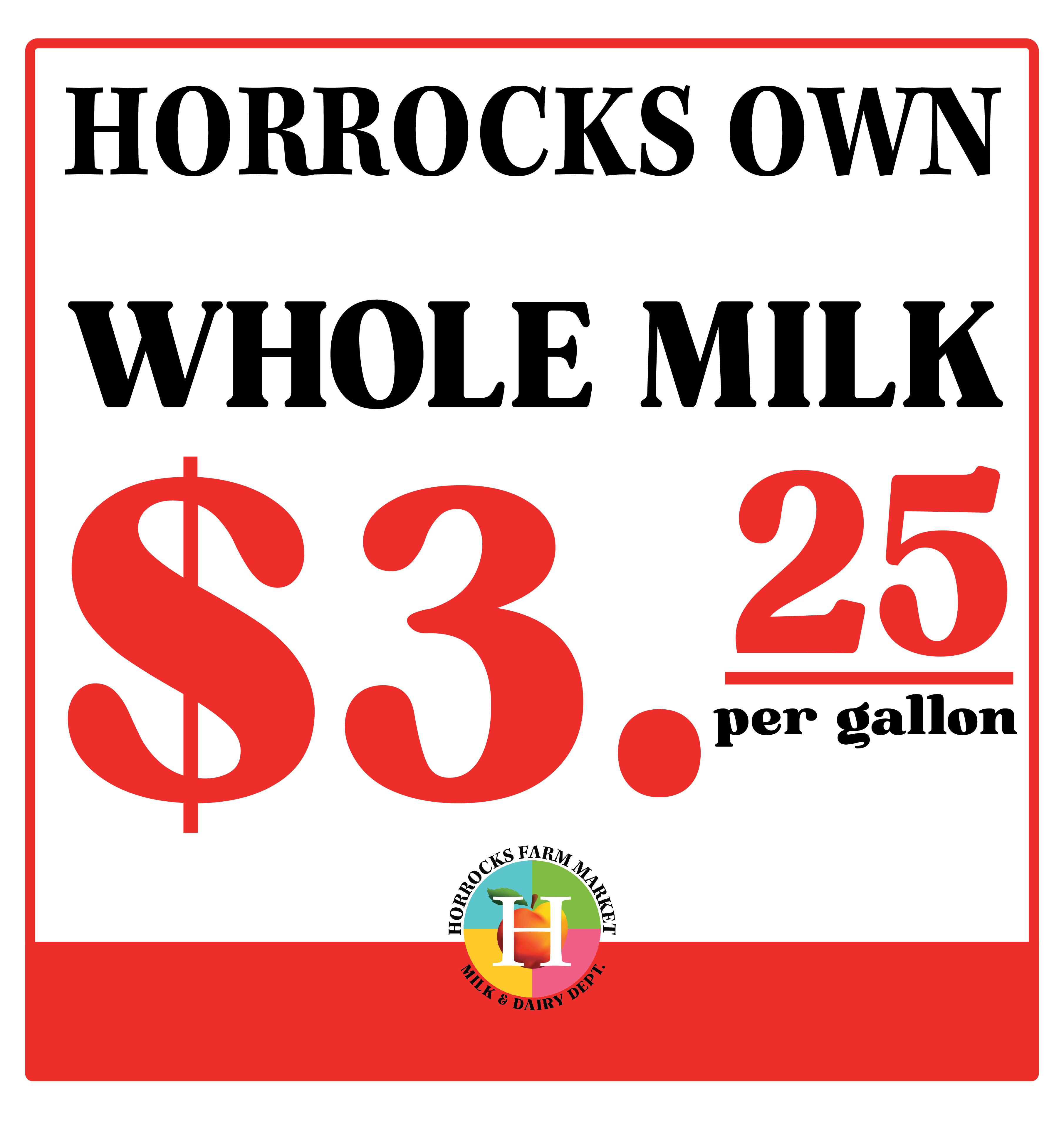
Horrocks Farm Market needed an upgrade from functional, ad-hoc design. In my time at Horrocks, I expanded the commercial viability of the family store by redesigning its logo, forming a standards manual, developing brand merchandising, rebranding the Beer Garden, branding the Ice Bar (a short-lived winter outdoor bar during Covid) and Pizzeria, as well as rebranding and updating various company documents, signs, and store departments to reflect the new logo and better fit the Horrocks brand. Through the new brand merchandising alone, I helped to generate over $30K in net sales within the first eight months.
In my first year as Director of Art & Media, I was a one-man art, marketing, and web department. In my second year, I trained and collaborated with a design assistant, guiding her in all the skills needed to operate the department after my departure. At Horrocks, I completed an estimated 1000 projects and directed over 300 (I only started tracking projects after my first year there).
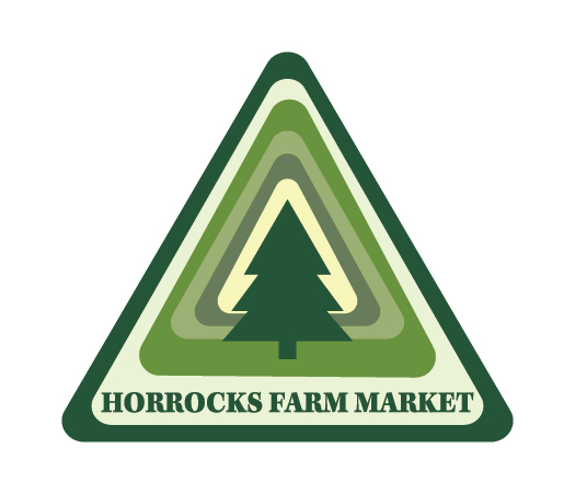
Remaking the Horrocks logo was not a project that I saw myself doing when I began this position.
It happened out of necessity, as the only file of the old logo I had was just a jpg or png. Originally, my goal was simply to make an editable file of the previous logo. In the process of doing so, however, Autumn Horrocks told me that the fruit was supposed to be a peach and not an apple, which is why if you see the old logo, you’ll notice that the “apple” has a weirdly orange gradient. So I played around and drew a peach, and with some Adobe magic, I made the logo mark you see now.


With no file to tell me what the original font had been, I embarked on a hefty process of comparison to the original. Kepler Std. became the official typeface for the logotype. Clean and proper serif with its own quirks and funkiness, Kepler Std. fits the Horrocks brand without coming across as too bland or stiff.
The switch from a black H to a white H was both for a brighter design and to showcase the hope one carries through hardship. The redesigned logo is now visually happier and lighter, making it more flexible for a larger range of uses. This better represents the Horrocks experience that people know and love.
Why a peach?
Back in the day, Jerald Horrocks got a whole truckload of bad Michigan peaches, and he had to dump them. It was a huge loss, but because of this, the peach became a symbol of perseverance through trials and loss as well as continually fighting for hopes, dreams, and family.
Beer Garden
The Summer 2021 redesign of the Beer Garden branding was an evolution from scant design concepts from before I began my position. The Horrocks owners envisioned a European feel to the whole garden center area, with an outdoor bar and villa for people to hang out, have a beer, and shop for plants. They also wanted to make the garden center space more usable in the off-season. I brainstormed around the key theme of beer, and my overall design approach was to keep it simple and utilize more negative space and simple organic line borders. I licensed out the hops and changed them to my needs, as I had a tight 1-2 week turnaround. I then created the design work around the hops in conjunction with the type. This resulted in an elegant and sophisticated European aesthetic while also portraying a bold but welcoming impression.
This was also Horrocks’ first venture into merchandising on a large scale, in which I had to research, design, mock, format, and prepare the files for printing. We started with a t-shirt, hoodie, crewneck, pint glass, sticker, and sunglasses. In the second year, we added a long sleeve tee with a sleeve graphic and a small sticker.


Ice Bar
The updated Ice Bar branding followed the same design principles as the Beer Garden, but with a frozen twist. The main challenge was to convey the winter visuals without resembling holiday design. To do this, I crafted a mostly blue color palette for an icy feel. From there, I took inspiration from the greenhouse where the bar would be located, using orange to represent the greenhouse’s warm escape from the cold of winter.
I created icicles for the bottom of the design and “froze” the hops licensed to Horrocks with a cool blue palette. I then added simple geometric shapes to convey the iciness and sparkle of winter, and to help fix the eye on the graphic longer. Finally, I created the snowflake from scratch, as it had to be simple enough to be broken up and still work with the branding as a whole.


The Rest of The Store
Horrocks Pizzeria
The Horrocks Pizzeria went through many name changes at the hands of the Horrocks owners and head chef during development: Chestnut Lane Pizzeria, The 1969 Pizzeria, Jerald’s Pizzeria, and so on. But in the end, we settled on what works. I chose to use OhNo Type Foundries Blazeface for the branding, as it simply spoke “pizzeria branding” to me. It reminds me of some good dough.


Meat, Deli, Etc.
I often use Disney World as an analogy for the store departments and the development of their respective design. Each area of the store has its own aesthetic, yet it’s all Horrocks, much like all the different parks in Disney World. They each stand out on their own and help create a more unique experience, but in the end, they’re a part of a whole. At Horrocks, the unique departmental design also helps people to know where they are in the maze we call a store! These are some of the departments I have reworked or rebranded.


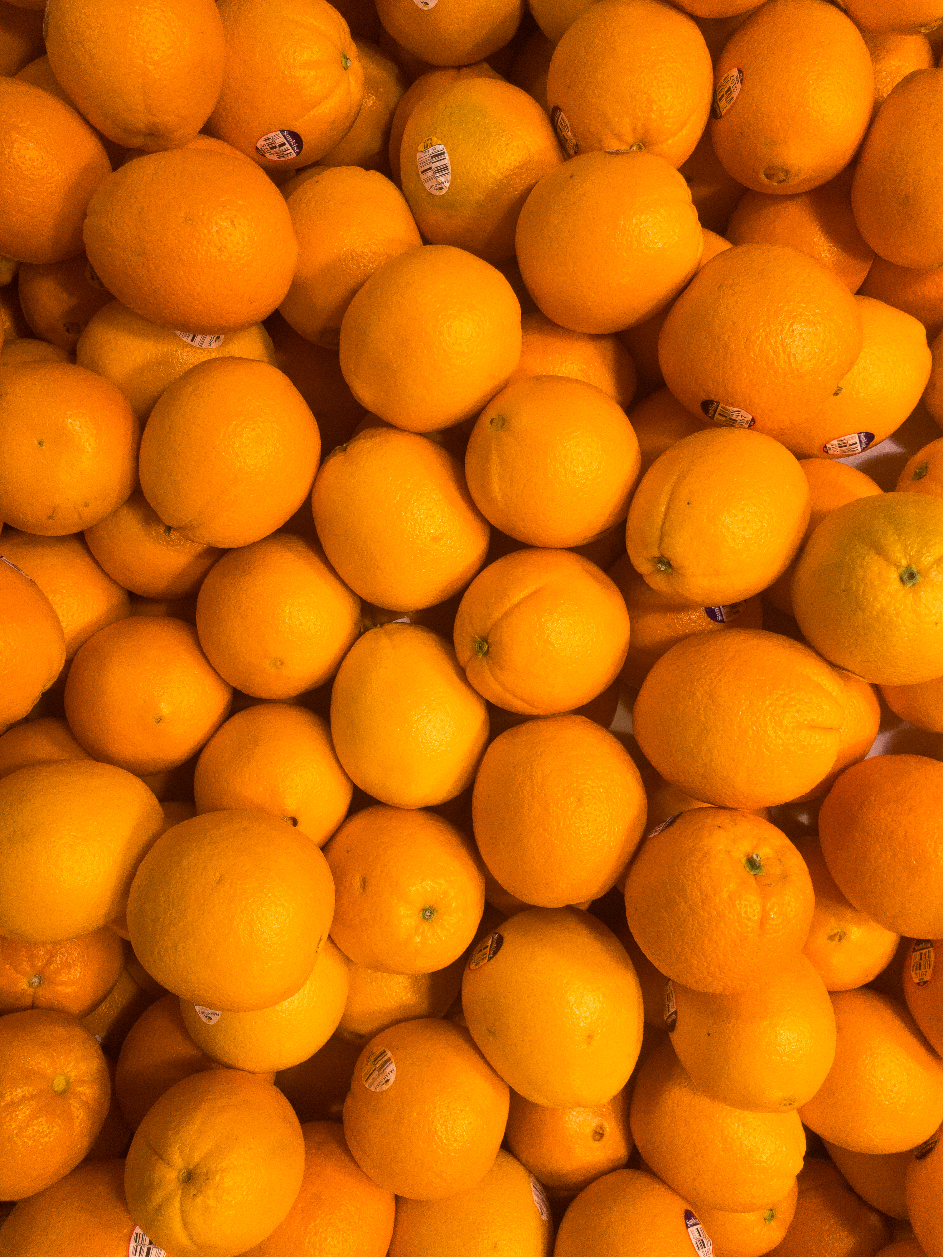
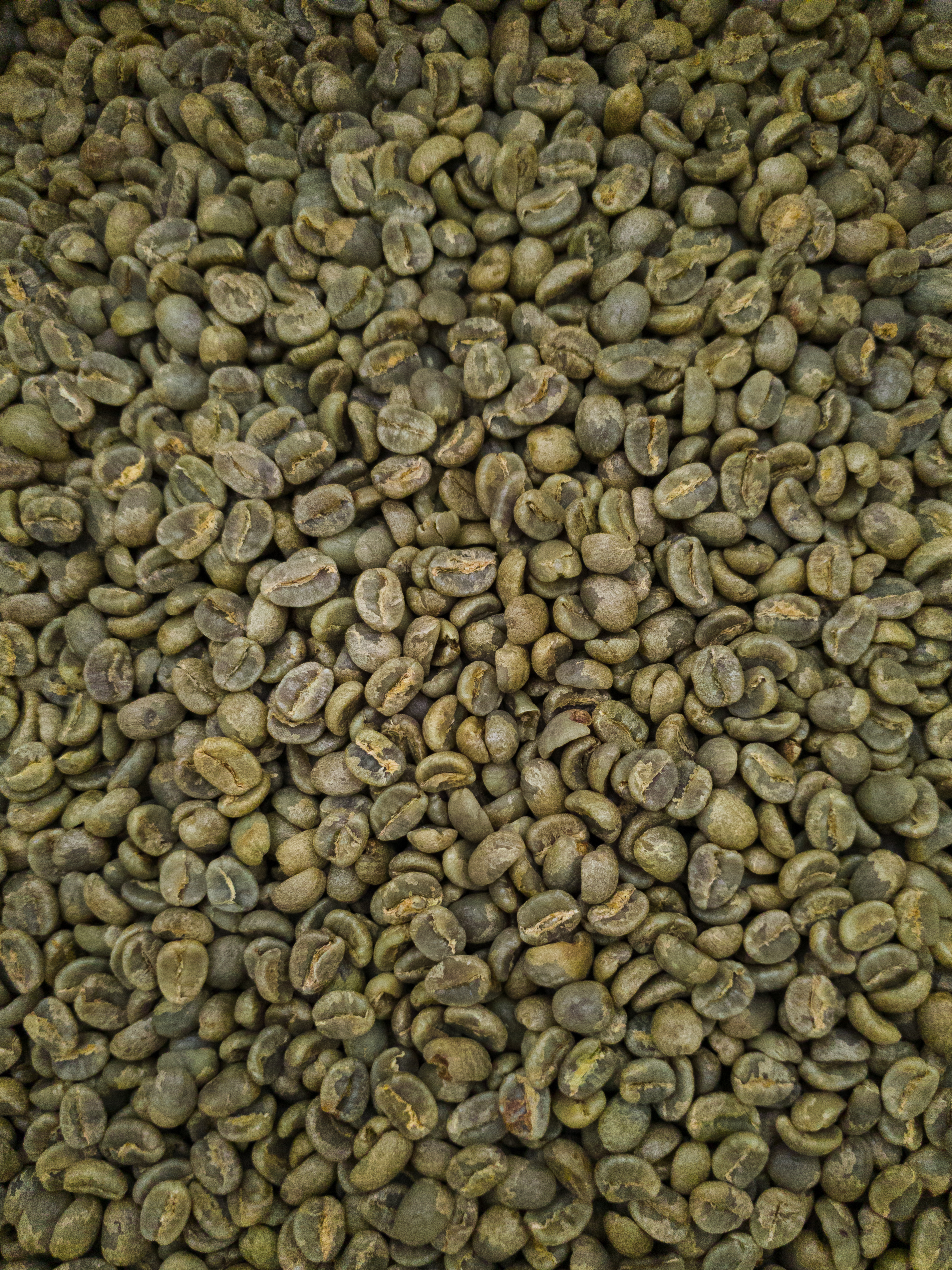
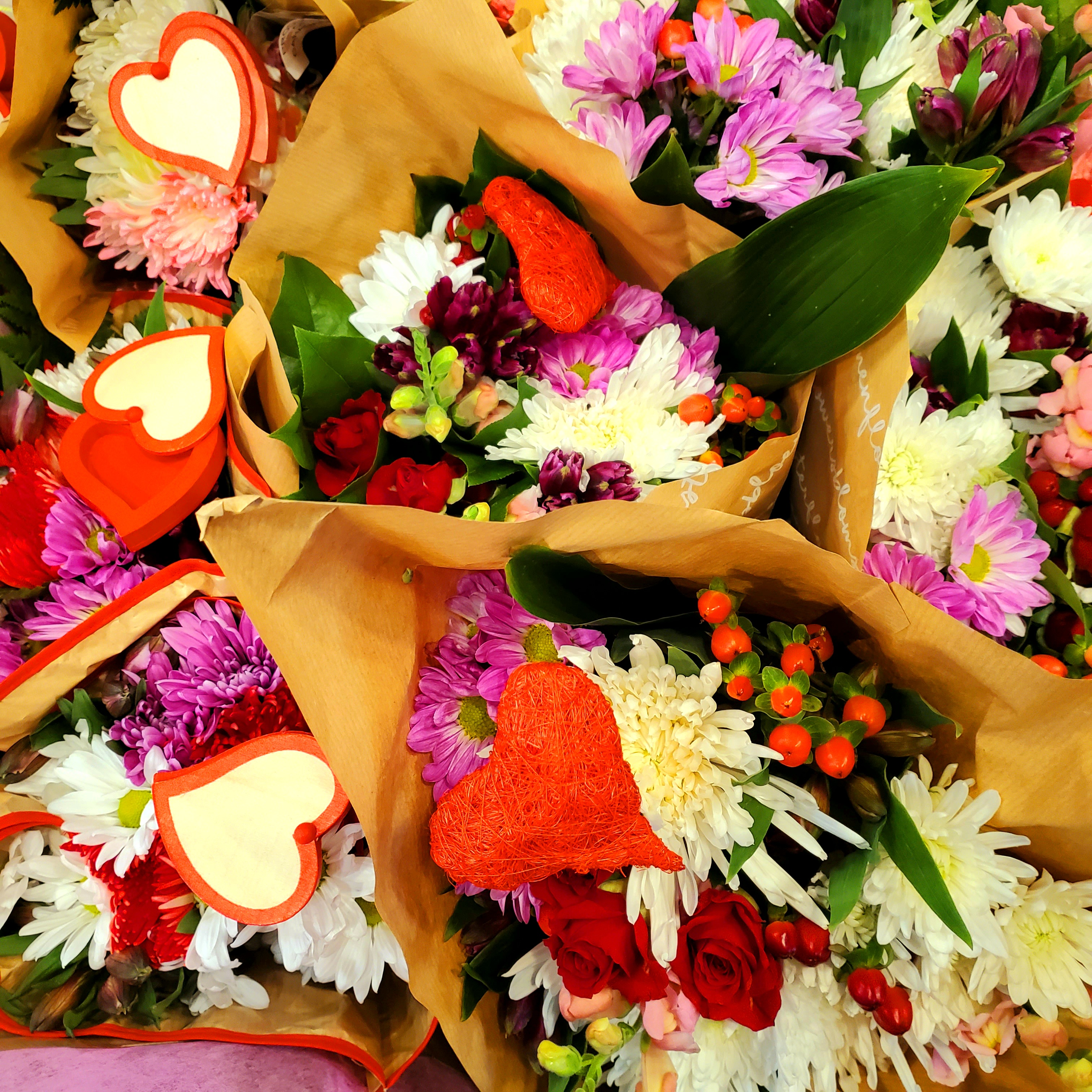
Photography
With no space for a photo booth , I’ve learned how to take good photos with just my phone, an occasional stepladder, and the lighting that’s provided. It can made for some frustrating times when the lighting was off, a subject was too dark, or customers bumped into me or took something from my setup. But it taught me to work with the bare minimum and to get the gold out of any situation.
My goal for the photos was to capture the product from an overhead perspective that made you believe that it was boundless, never-ending. This also allowed the photos to be used as backgrounds, textures, and as other graphic elements in projects.


Cool Extras
Here are some more designs and layouts that I made while at Horrocks. Most of these designs are in-use, while others are one-offs and concept work for projects that have yet to be made.
My time at Horrocks Farm Market perfectly embodies the chaos of a family business and a retail graphic design position. What is shown is just scratching the surface of all the content that I created while there.
In June 2022, I was approached by Lansing Catholic High School to head up their design and help with their marketing, and by the end of July, I transitioned over to LCHS while my assistant took over as Director of Art and Media for Horrocks.
All content shown on this page is copyrighted and owned by Horrocks Farm Market, Inc. unless otherwise implied and is only being used as portfolio pieces to showcase the skill and ability of Seth Nelson of NelsoArt Studio.


You must be logged in to post a comment.